Apr 24, 2026, For agents
Photos that sell a property better


This guide covers what works best in a listing: what to use as a cover image, what to show next, how many photos you actually need, and which ones to skip
What to use as a cover image
The first photo decides whether someone opens the listing or skips it. So the cover should be clear and strong — not random. There are a few ways to choose it. Let’s go from strongest to weakest
1. Interior — the strongest option
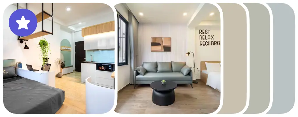
This is usually the best choice. When people look for a place, they want to see the space they’ll actually live in. The first photo should answer a simple question: open or skip?
2. A strong feature — also a good option
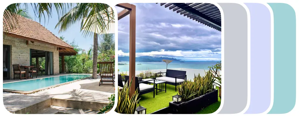
A pool, large terrace, garden, or a rare panoramic view. This works well if it’s the main advantage of the property. But only if it’s truly strong — not something made up
3. View from the window or balcony — not the strongest option

Many people like a good view — sea, city, or garden. It can be a strong selling point. But if the interior is dark, too small, or uncomfortable, the view won’t save it
4. Secondary features don’t work well as a cover
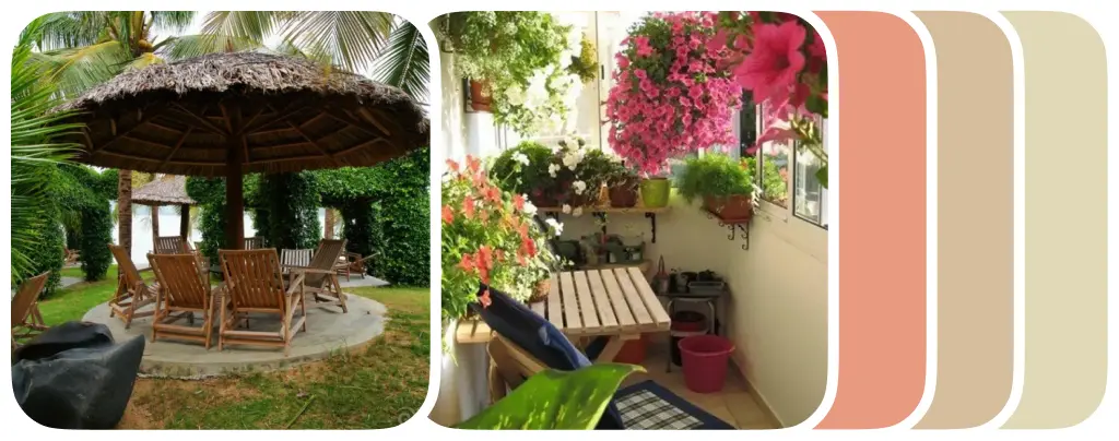
Terrace, balcony, BBQ area, plants, a small green space. These are nice extras, but not strong enough for a cover. They work better later in the gallery
5. Facade, beach, promenade, courtyard — a weak option

They might look nice, but they sell the area, not the property. People want to see the property first
6. Everything at once — the worst option
Collages, multiple photos in one frame, trying to show the bedroom, kitchen, balcony, and view all at once. On a small preview, everything blends together, and it’s hard to understand what it is
What to show after the cover
After the first photo, the most important thing is to quickly understand three things: how the space is set up, the condition, and the key pros and cons. So the photos should follow a logical order, not be random
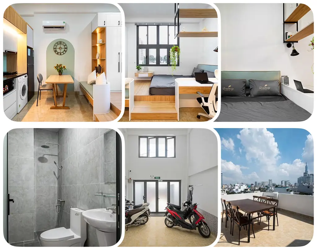
- The main living space — where people will spend most of their time
- 1–2 additional shots of the same space — to show light and how the space is set up
- The bedroom or sleeping area — one of the key zones
- The kitchen and dining area — even if it’s small, show it honestly
- The bathroom — not first, but in the first half of the gallery
- The view, balcony, or terrace — after the main areas
- Property features — pool, garden, laundry, parking, workspace, and other strong points
The main principle is simple: first the main space, then the sleeping area, kitchen, and bathroom, then the extras, and only after that — everything around it
How many photos you need
Too few photos raise doubts. Too many similar shots get tiring. Usually, 8–15 good photos are enough:
- cover
- main living space
- a few more shots of the same space
- bedroom
- kitchen
- bathroom
- view or balcony
- 1–2 strong features
You don’t need 3 photos, and you don’t need 40 almost identical ones. Fewer, clearer photos are better
What not to include

Some things don’t help and only make the listing worse:
- Everyday items — dishes, sponges, bottles, pots, bags, drying racks, buckets, mops
- Personal items — clothes, shoes, cosmetics, toys, medicine, documents, photos
- Mess — overloaded surfaces, items on the bed, boxes, cables
- Dark or poor-quality shots — blurry, too yellow, or taken in bad light
- Duplicates — similar photos of the same room
- Unimportant technical shots — parts of walls, corners of furniture, boilers, sockets, empty corridors
The main point
Each photo should either help understand the property or make it look better. If a photo doesn’t add clarity or trust, it’s better not to upload it